Flex Breakpoints
Breakpoints Overview
Breakpoints are pixel ranges that correspond to the width of different devices, such as desktop, tablet, and mobile. When the width of a device is within a breakpoints predefined pixel range, the layout of the site is adjusted so the content and design is optimized for that device size and orientation. For example, if I am viewing a site on a desktop computer I can view the full site menu, but when I view the site on my mobile device, I see a hamburger menu instead.
Flex Breakpoints
The main breakpoint for Flex is desktop. If you make design or content changes to the desktop breakpoint, the changes are automatically applied to the other breakpoints for wide desktop, tablet, and mobile. If you change content, such as adding a widget, replacing an image, or editing text, the change automatically applies to all other breakpoints, regardless of which breakpoint the change was made on.
However, if you make changes to the position or size of an element on specific breakpoints the changes will not apply to other breakpoints. For example, if you change the size of an element on the mobile breakpoint, the change will only apply to the mobile and mobile landscape breakpoints and no other breakpoints.
In Flex, the default breakpoints are:
- Desktop (1025px-1399px)
- Wide desktop (1400px and up)
- Tablet (768px-1024px)
- Mobile (767px and below)
- Mobile landscape (468px-767px)
Note
We recommend checking mobile breakpoint changes on a mobile device, instead of resizing a desktop screen.
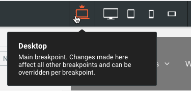
You can switch between breakpoints at the top of the page by clicking the different views.

Structural Changes
Structural changes made on any breakpoint affect all other breakpoints. When you are on a breakpoint other than the main breakpoint (desktop), and make a structural change, a warning message displays to inform you that the change affects all breakpoints. Structural changes include content or layout changes, such as adding or deleting sections, columns, Inner Columns, widgets, or advanced grids.
Hide on Breakpoint
You can hide certain elements on specific breakpoints from the layers panel or from the element’s floating menu. For example, you can hide an image on mobile devices and it will not affect other breakpoints.
Note
If you hide an element that has other nested elements within it, all nested elements will also be hidden on that breakpoint. For example, if you hide a flex column it will also hide the widgets within that flex column.
To hide an element on a specific breakpoint:
- Switch to the breakpoint you want to hide the element on by clicking the view in the top navigation.
- Click the element you want to hide.
- Click the three horizontal dots icon () on the floating menu and select Hide on this breakpoint. Or in the layers panel, click Hide on this breakpoint next to the element.
Breakpoint Overrides
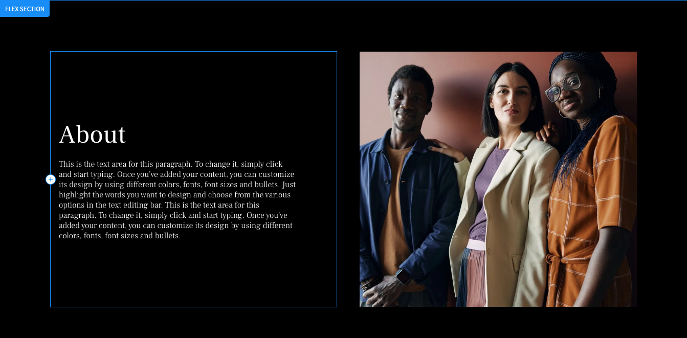
When changing content, you can make the change from any breakpoint and it will affect all breakpoints. However, there are certain times when you need to override a breakpoint. For example, on the main breakpoint an image is to the right of a paragraph, but on mobile you need the image to be on top and the paragraph below.
The following are changes you can make to an element and override the main breakpoint:
- Alignment
- Position
- Size
- Spacing
Note
Once you override a breakpoint, you cannot reverse the change by changing the style in the main breakpoint on the same object.


