Image Size Guidelines
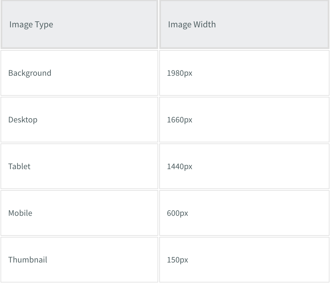
Each time you upload an image, up to 5 reduced-size copies of the image are created. Website Builder then automatically inserts the appropriately sized image into the desktop, tablet, and mobile sites, making sure your site visitors always see the correct sized image for their device.

The size of the uploaded image is not increased and only images that are smaller than the original are created. For example, if a 2000px width image is uploaded, 5 new optimized copies will be created. If a 100px width image is uploaded, no new images will be created.
The total area of an image cannot exceed 3,145,728 pixels. It is unlikely any of your images will be over this limit, but you can quickly check by multiplying the pixel width by the height.
The Slider widget is normally used with larger sized images for dramatic effect. Sliders commonly stretch from end to end, so
it is good to use images with more width to fit the slider. For square sliders, use an even aspect ratio such as 1:1.
It is best to choose images with good padding so that the main content of the image is not cut off when resized. The image ratios should be the same in the slider for design consistency.
Common aspect ratios: 16:9, 3:4
Common resolution sizes (px): 1600x900, 1280x720, 1280x960
Note
Mobile devices often have the opposite aspect ratio compared to desktop devices. You may have to use the hide on device feature to display mobile sliders correctly.
The Photo Gallery widget is the most flexible widget to use with images, because there are so many layout options. For example, you can have a tiled gallery which is the same size for all images, or mosaic which is a different size per image.
The aspect ratio of images in the Photo Gallery should reflect how you want it to display.
For example, square style galleries should have 1:1 ratio of images.
Tall image style galleries should have longer height ratios, like 2:5, or 200px by 500px.
The image ratios should be the same for design consistency. Leave some padding in the image to use the hover effect so that your images do not get cut off.
Common aspect ratios: Any aspect ratio.
Common resolution sizes (px): Any resolution, but not larger than 1500px for page speed.
Icons are a very important part of any site. They are visual markers for information and can add a modern look to your site. You can use transparent PNGs, JPEGs or SVGs.
Common aspect ratios: Generally 1:1, but any aspect ratio will work.
Common resolution sizes (px): 200x200, 80x80 or any resolution. SVGs can be any resolution.
Favicons are not used on your actual site, but rather displayed on the tab when users open your website.
Required aspect ratio: 1:1
Allowed resolution sizes (px): 24x24, 36x36, 48x48
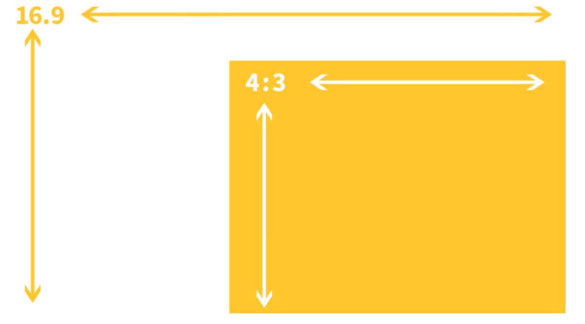
Aspect ratio is the ratio of an image's width and height attribute. A 16:9 aspect ratio can be a 16x9 px image, or a 1600x900 px image. It is basically any image resolution that has the ratio of 16:9.
Visualizing the two most common aspect ratios:

While images are optimized on your site, it does not actually resize the design of images on your site. If you use an image on the desktop that has an aspect ratio of 16:9, it will look perfect on the desktop since a desktop device is wide. A mobile device, however, is much smaller, and so a 16:9 aspect ratio will sometimes look small.
To compensate, you can either use the hide on device feature to create specific versions for those devices or you can resize the image's dimensions to fit. Changes to size are device independent.
Uploading the biggest resolution for your site guarantees that your site's images are high resolution for your clients and customers. However, keep in mind that large images also have a drastic effect on your page speed. Since high-resolution images are scaled down, users do not normally notice the difference in resolution. It is better to upload images that are as large as how they are intended to be used. For example, if you have a picture that is 300px by 300px on your site, you do not want to upload it as a 4000px by 4000px image.
Optimized Image Sizes per Device

The size of the uploaded image is not increased and only images that are smaller than the original are created. For example, if a 2000px width image is uploaded, 5 new optimized copies will be created. If a 100px width image is uploaded, no new images will be created.
Maximum Image Size
The total area of an image cannot exceed 3,145,728 pixels. It is unlikely any of your images will be over this limit, but you can quickly check by multiplying the pixel width by the height.
Image Size Guidelines per Widget
Slider
The Slider widget is normally used with larger sized images for dramatic effect. Sliders commonly stretch from end to end, so
it is good to use images with more width to fit the slider. For square sliders, use an even aspect ratio such as 1:1.
It is best to choose images with good padding so that the main content of the image is not cut off when resized. The image ratios should be the same in the slider for design consistency.
Common aspect ratios: 16:9, 3:4
Common resolution sizes (px): 1600x900, 1280x720, 1280x960
Note
Mobile devices often have the opposite aspect ratio compared to desktop devices. You may have to use the hide on device feature to display mobile sliders correctly.
Photo Gallery
The Photo Gallery widget is the most flexible widget to use with images, because there are so many layout options. For example, you can have a tiled gallery which is the same size for all images, or mosaic which is a different size per image.
The aspect ratio of images in the Photo Gallery should reflect how you want it to display.
For example, square style galleries should have 1:1 ratio of images.
Tall image style galleries should have longer height ratios, like 2:5, or 200px by 500px.
The image ratios should be the same for design consistency. Leave some padding in the image to use the hover effect so that your images do not get cut off.
Common aspect ratios: Any aspect ratio.
Common resolution sizes (px): Any resolution, but not larger than 1500px for page speed.
Icons
Icons are a very important part of any site. They are visual markers for information and can add a modern look to your site. You can use transparent PNGs, JPEGs or SVGs.
Common aspect ratios: Generally 1:1, but any aspect ratio will work.
Common resolution sizes (px): 200x200, 80x80 or any resolution. SVGs can be any resolution.
Favicon
Favicons are not used on your actual site, but rather displayed on the tab when users open your website.
Required aspect ratio: 1:1
Allowed resolution sizes (px): 24x24, 36x36, 48x48
Aspect ratio vs Resolution
Aspect ratio is the ratio of an image's width and height attribute. A 16:9 aspect ratio can be a 16x9 px image, or a 1600x900 px image. It is basically any image resolution that has the ratio of 16:9.
Visualizing the two most common aspect ratios:

Aspect Ratios per Device
While images are optimized on your site, it does not actually resize the design of images on your site. If you use an image on the desktop that has an aspect ratio of 16:9, it will look perfect on the desktop since a desktop device is wide. A mobile device, however, is much smaller, and so a 16:9 aspect ratio will sometimes look small.
To compensate, you can either use the hide on device feature to create specific versions for those devices or you can resize the image's dimensions to fit. Changes to size are device independent.
Considerations
Biggest is not always the best
Uploading the biggest resolution for your site guarantees that your site's images are high resolution for your clients and customers. However, keep in mind that large images also have a drastic effect on your page speed. Since high-resolution images are scaled down, users do not normally notice the difference in resolution. It is better to upload images that are as large as how they are intended to be used. For example, if you have a picture that is 300px by 300px on your site, you do not want to upload it as a 4000px by 4000px image.
Updated on: 01/27/2025
Thank you!
