
Support Articles
Stay Connected
Shape Widgets
The Shape widget is a design tool that can be used to highlight important messages. Create buttons and banners, call out awards, and highlight sale prices. You can add an image, color background and text, control the size, and add shadows. The widget can be placed on any location for complete flexibility.
To add the widget:
- In the left panel, click Widgets.
- Click and drag the Shape widget into your site.
To learn more about adding widgets to your site, see Add Widgets.
Content Editor
To access the content editor:
- Right-click the widget, and click Edit Content.
- Select a shape.
- To add a link to the shape, click Add Link.
- Type a title and description for the shape. To hide the title and description, click the eye icon.
- Type Alt text and a Tooltip for the shape.
Design Editor
To access the design editor:
- Right-click the widget, and click Edit Design.
- Click Layout to select a different layout for the shape.
- To place the widget on top of or overlapping an image or another widget, click the Spacing tab, and configure the margins to be a negative number (for example, -50px).
Make sure the design settings you define are correct per device. Settings such as spacing (of the whole widget and individual items), width and more are defined per device. For more information, see Edit by Device.
For information about design options that are not specific to this widget (for example, layout, style, or spacing), see Widget Design.
Examples
Create a Shape on the Header
To create a shape on the header:
- Create a row with two columns.
- Choose an amorphic shape and add it to the right-side column.
- Make the shape as big as the column.
- In the Design Editor, select the layout with the background image and replace the image with the one you want.

Use a Shape as a Button
To use a shape as a button by adding a link and hover effect:
- Select the circle shape and add a title and description.
- Select colors for the shape and texts.
- To position the shape on the corner of an image, use a negative margin on the left side of the shape (spacing > margin > -50px left & top margin).

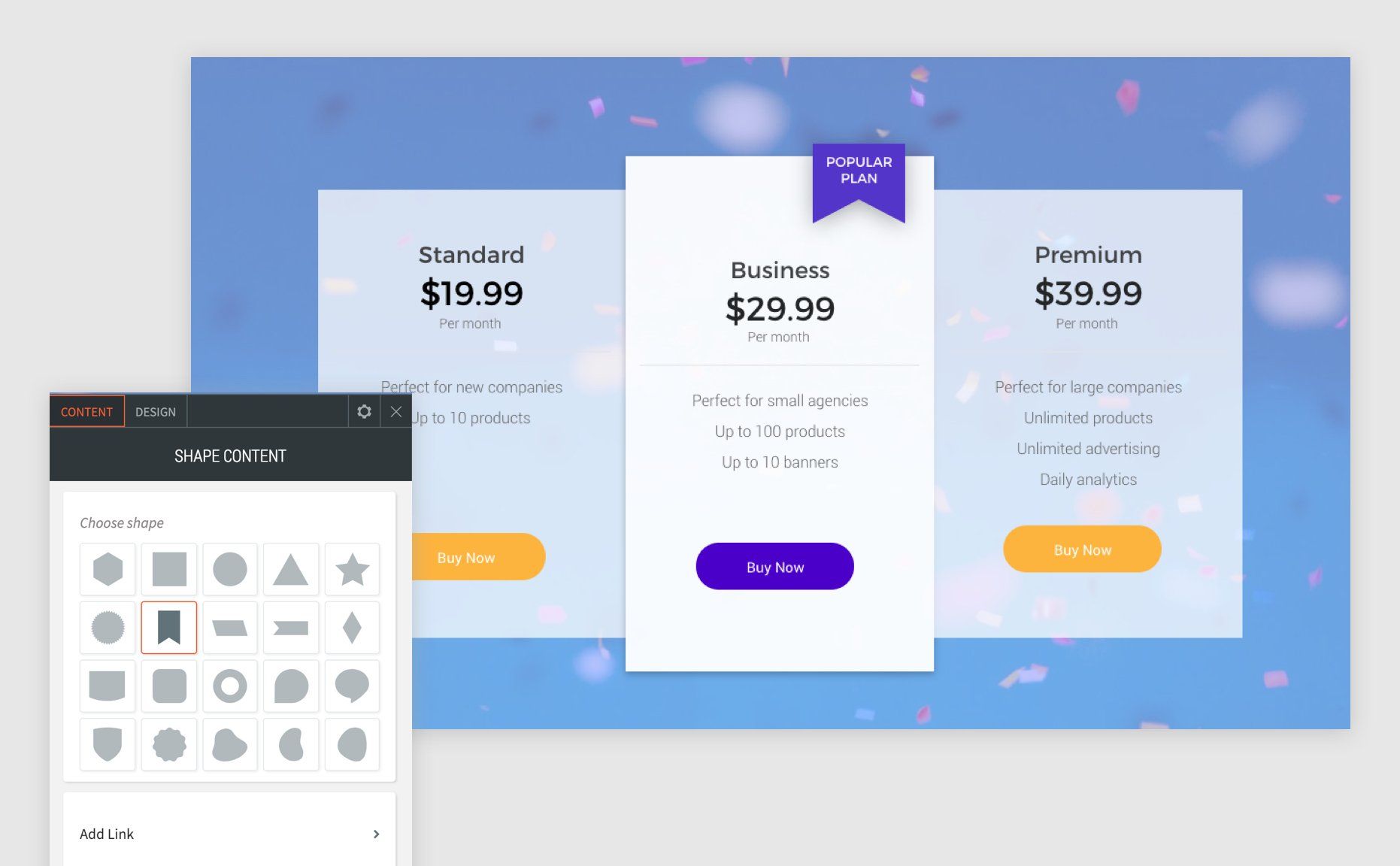
Highlight a Specific Plan or Service
To use shapes to highlight a specific plan or service:
- Choose the flag shape and add a title and short description.
- Toggle off Keep proportion so you can adjust only the width.
- Select colors for the shape and texts.
- To position the shape so it overlaps the top of a column, use a negative top margin (spacing > margin > -30px top margin).
Create a Scroll Button
To use a shape to create a scroll button:
- Choose the diamond shape and add a title.
- Toggle off Keep proportion so you can adjust only the width.
- Select colors for the shape and texts.
- To position the shape on top of an image, use a negative top margin (spacing > margin > -50px top margin).

Related Articles


